
Background
At Enlight Your Data, we thrive on turning data into actionable insights. Our recent collaboration with a leading pharmaceutical company exemplifies our commitment to streamlining processes and driving efficiency. The client faced a common challenge: their reporting team spent significant hours manually downloading data, wrangling spreadsheets, and refreshing templates. The management recognized the need for change and sought a solution that would empower their team to focus on what truly matters: data analysis.
The Challenge
- Manual Work: The reporting team grappled with repetitive tasks, leaving little room for strategic analysis.
- Time-Consuming Process: Daily reporting involved downloading data, populating Excel templates, and ensuring accuracy—a time-intensive process.
- Missed Opportunities: With their hands tied in administrative work, the team couldn’t fully explore market trends or identify growth opportunities.
Our Solution: Power BI Magic
1. Automating the Data Flow Process
We rolled up our sleeves and got to work. Our first step was to create an end-to-end automated data flow—from the data source to the final report. We integrated cutting-edge business intelligence tools that seamlessly pulled data from various databases, APIs, and spreadsheets. No more manual downloads or copy-pasting—just a smooth, automated pipeline.
2. Fewer Hands, Greater Efficiency
By implementing this automated process, we drastically reduced the number of people involved. Instead of a large reporting team, our client now needed only a lean crew of 2 or 3 individuals who ensured data sanity and provided continuous support for process improvements. With fewer cooks in the kitchen, decision-making became agile, and bottlenecks vanished.
3. Timely Insights
Time is of the essence in the pharmaceutical industry. Our solution ensured that the reports were generated promptly, without delays. Daily insights were at their fingertips, empowering the management to make informed decisions swiftly. Whether it was tracking sales, monitoring clinical trials, or analyzing market trends, our client had real-time access to critical data.
4. Minimizing Human Error
Remember those Excel templates? We replaced them with pre-set functions that were executed flawlessly every time. No more accidental typos, no more misplaced formulas. Our automated system followed the same steps consistently, eliminating the risk of human error. The result? Reliable reports that the management could trust implicitly.
Results and Impact
1. Reducing People Cost
With fewer team members involved, our client significantly cut down on personnel costs. The lean team efficiently managed the entire reporting process, proving that quality doesn’t always require quantity.
2. Time-Saving on Data Manipulations
Gone were the days of manual data downloads and template updates. Automation shaved off precious hours, allowing the team to allocate their time to more valuable tasks.
3. Time Efficiency on Decision Making
Real-time insights meant faster decision-making. The management no longer had to wait for reports; they could act swiftly based on up-to-date information.
4. Enhanced Data Visualization and Display
Our automated system didn’t just crunch numbers—it presented them beautifully. Interactive dashboards, charts, and graphs made data come alive, enhancing communication, and understanding.
Report Design
1. Dynamic KPIs
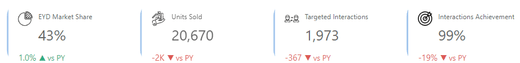
The report we created showcased essential Key Performance Indicators (KPIs):
- % Market Share: Real-time insights into the client’s market position.
- Units Sold: A clear view of sales performance.
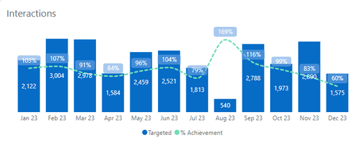
- Targeted Interactions: Tracking engagement metrics and trends.
- % Interactions Achievement: Measuring success against targets.
2. Interactive Charts
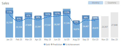
Sales Combo Chart: Visualizing units sold, % achievement, and predictive trends for the upcoming months. Users could toggle between monthly and quarterly views, gaining deeper insights.
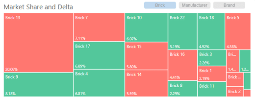
- Market Share Treemap: A colorful representation of market share by territory, manufacturer, and brand. Competitor brands were also included, providing a holistic view.
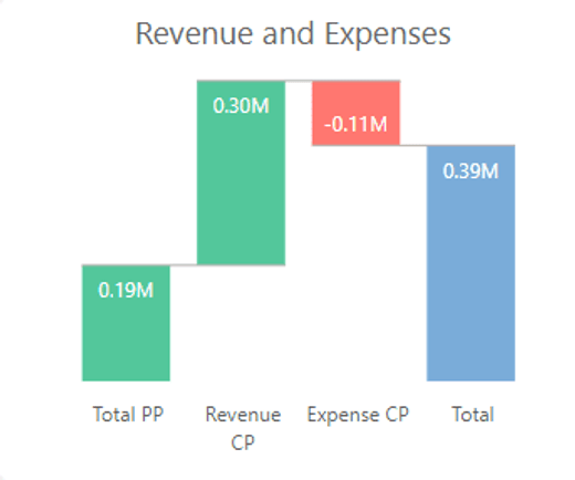
- Revenue and Expenses Waterfall Chart: A clear visualization capturing the ebb and flow of revenue and expenses and revealing the net outcome.
- Interactions Combo Chart: Monthly insights into interactions, with a clear line showing achievement levels.
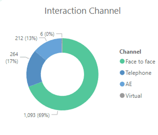
- Interactions Channel Donut Chart: A donut chart displaying interaction channels—engaging and easy to interpret.
At Enlight Your Data, we believe that data holds the key to success. Let’s unlock it together!
P.S. If you’re tired of Excel spreadsheets, let’s chat!